
-
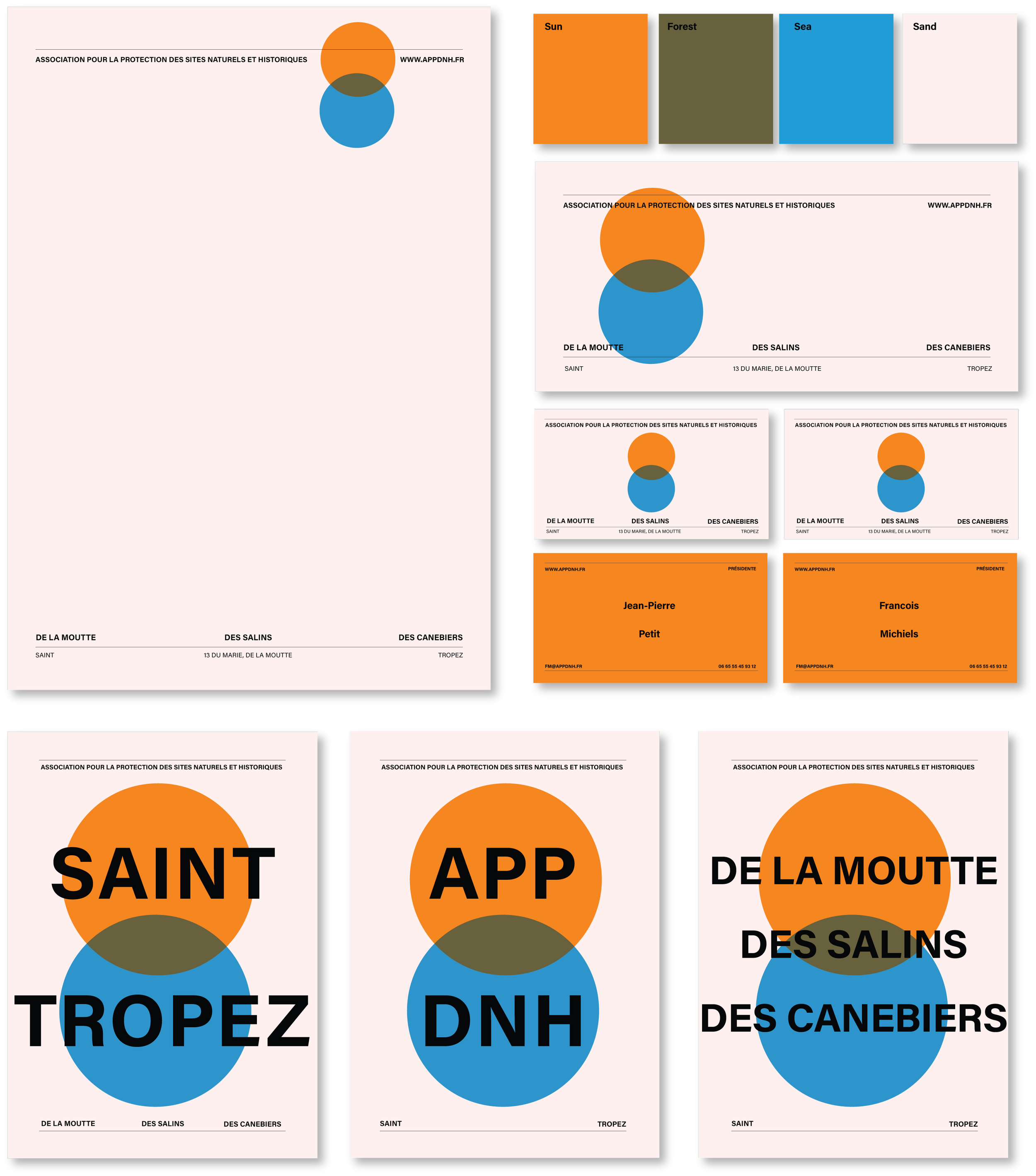
For the municipality of Saint Tropez, our brief was to develop a visual identity for Association that manages the protection of the nature and historic sites across the region.
-
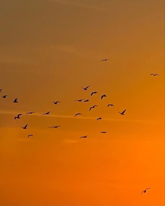
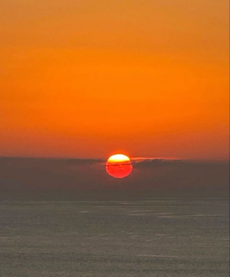
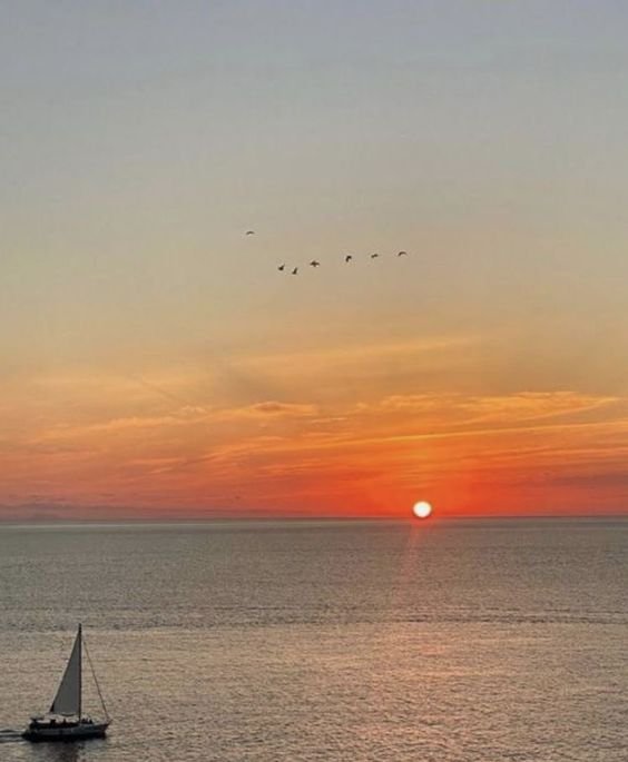
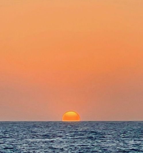
Our creative idea was to develop a strong visual graphical treatment using circular shapes that represent the sun and the sea. When there colors are overlapped, it creates the green - the nature. The simple, meaningful and impactful identity was born.

-
The union of the sun and the sea gives rise to the beauty of nature. This synergy is vividly depicted in our color blocks, where the merging of sunset orange and the tranquil water manifests in the deep green hue.


-
3 KEY SOAPS THAT ARE SCENTED WITH THE ELEMENTS OF SUN FOREST AND SEA. THE SOAPS ARE NAMED AFTER EACH PROTECTED REGION
-
A POSTER DEVELOPED WITH ALL THE NAMES OF THE DONORS FOR THE ASSOCIATION. LOCAL DONOR FUNDING IS A LARGE PART OF THE ACTIVITIES THAT THE ASSOCIATION CARRIES OUT.

